- Introduction to UI/UX Design: What It Is and Why It Matters
- Basic Color Theory ⇐
- Introduction to Typography Basics
- Design Principles
- UX Research
- Information Architecture
- Design Thinking
- Usability Testing
- Adaptive and Responsive Design
- Design Systems
- Inclusive Design
Overview
Color serves as a potent tool for designers, impacting emotions, conveying messages, and shaping brand identity. It directs attention, considers cultural context, enhances aesthetics, and ensures inclusivity for all users. In essence, it's a foundational element that shapes people's perception and interaction with designs.
Psychological Effects of Color
Color psychology delves into how colors affect emotions and behaviors, exploring the connections between colors and feelings influenced by childhood memories, cultural associations, and personal preferences. When selecting colors for a project, consider color psychology to understand their impact.
Common Interpretations of Colors
Color association refers to how different colors evoke specific images, concepts, or connections in our minds. For instance:
- Red: Passion, activity, excitement, fire, heat, etc.
- Yellow: Happiness, energy, optimism, sunshine, etc.
- Blue: Calmness, freshness, cleanliness, ocean, coolness, etc.
- Green: Relaxation, trust, safety, nature, etc.
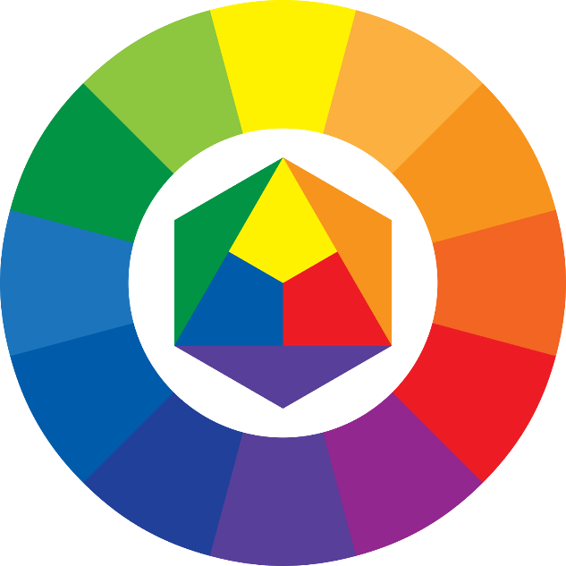
Types of Color Harmonies
Designers often create color schemes, which are sets of colors that complement each other well to suit the concept of the project. To select effective colors, start with understanding color harmony basics, utilizing the color wheel or a color calculator to discover harmonious combinations.
Monochromatic
Monochromatic color schemes revolve around variations of a single hue, emphasizing the intention through different saturations and values of the same base color.
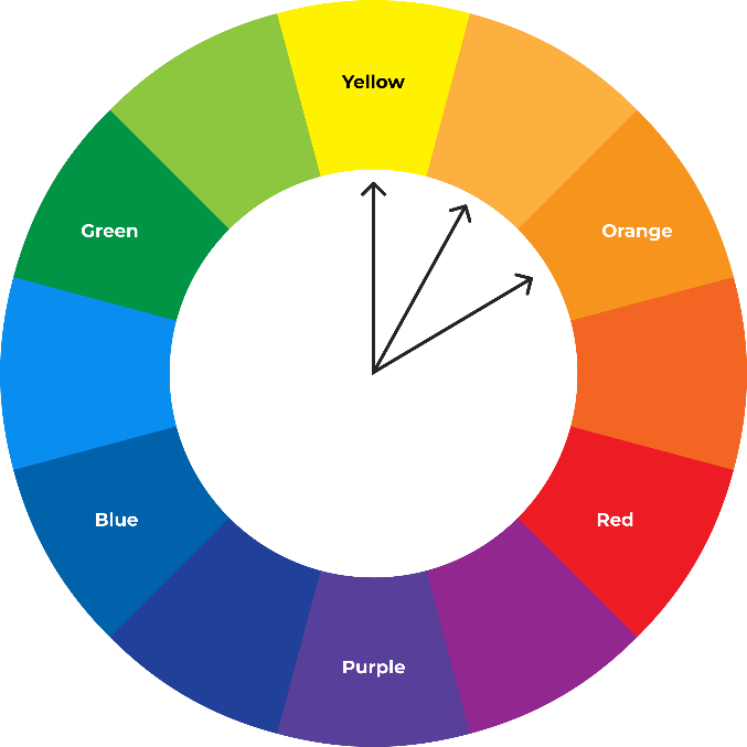
Complementary
Complementary color schemes consist of hues that are opposite each other on the color wheel, creating a high contrast and making each other appear more vibrant.

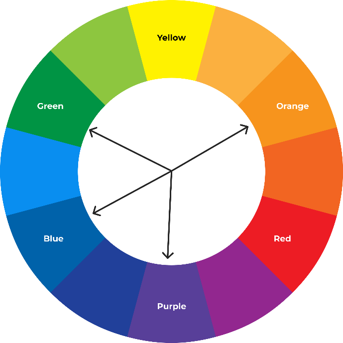
Analogous
Analogous color schemes comprise hues that are adjacent to each other on the color wheel, blending well together to create a harmonious and unified look with less contrast.
Analogous + Accent
Analogous color schemes with an accent color combine neighboring colors with a contrasting accent color, providing visual contrast and highlighting specific elements in the design.
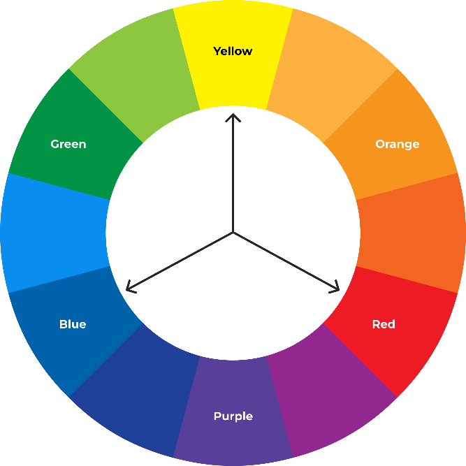
Triadic
Triadic color schemes involve three hues evenly spaced around the color wheel, creating a strong visual contrast while maintaining balance and dynamism.
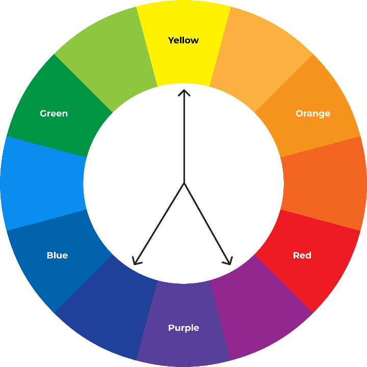
Split Complementary
Split complementary color schemes utilize variations of the complementary color scheme, offering contrast with less tension by using two neighboring hues alongside a base color.
Conclusion
In summary, color is a fundamental aspect of design, influencing emotions, conveying messages, and establishing brand identity. Its application to designs is a crucial process for designers, directing focus, respecting cultural nuances, enhancing aesthetics, and prioritizing inclusivity.